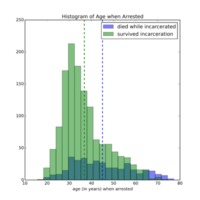
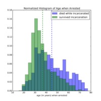
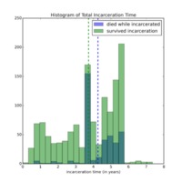
Histograms
In this section, I describe the methodology that I used to create histograms of interesting quantities derived from the main CSV file containing information on the 2679 clergy members incarcerated at Dachau Concentration Camp. In particular, I used the cleaned version of the CSV file that I produced for Palladio (this version of the CSV file had cleaned birthdates and arrest dates).
I chose to make my initial histogram plots in Python. One reason that I chose Python was that I am familiar with Matplotlib, the plotting backend of Python, making it easy for me to produce initial visualizations of this dataset. In addition, I could manipulate the data fields using Numpy, which provides a nice framework for doing cuts on data (for instance, finding the birthdates of all clergy from Germany).
Before making the plots, I first had to clean the file a bit more -- the work that I had done using regular expressions to manipulate the birthdates and arrest dates had left a few edge cases untreated. In particular, if an entry did not have a valid birthdate or arrest date (meaning the field was either blank or misformatted), I cut it from the dataset to be used for generating plots.
I then determined the fate of each of the clergy using the "Post-Dachau" field in the CSV file. The entries in this column were not regularized; however, many followed the same format of a date in the form (MM/DD/YYYY) followed by either "liberated," "released," or "perished". Because these entries were not regularized, I simply did a substring search for "liberated," "released," "perished," and "Death" within each field to determine whether the clergy member survived or died. If I could not determine the fate using this method, I cut the entry from the dataset to be used for generating plots. If I could determine the fate, I recorded the fate as a boolean:
- True if the string contained "Death" or "perished"
- False if the string contained "liberated" or "released"
I also cut entries that either did not have a final arrival date at Dachau or had a misformatted final arrival date, another field of the CSV file (I describe how I parsed this field below). In doing these cuts on the dataset to be used for generating plots, the dataset consisted only of entries with an associated diocese, birthdate, arrest date, final arrival date at Dachau, and fate. Though this induced a selection bias into the plots, it also eliminated the least-reliable entries: the ones with missing data fields. If I had access to how the CSV file was made, I could determine whether this was due to the entries coming from different sources and thus, whether this selection bias is indeed a bias. Without such access, I will assume moving forward that this selection serves primarily to "clean" the dataset further. On the Distribution of Incarcerated Clergy across Europe Using Carto page, I provide evidence that this selection bias does not impact the relative proportions of the different nationalities.
Next, because I wanted to calculate durations of time between two dates, such as arrest date and arrival date, I had to convert the dates into Python date objects -- the python datetime module provides functions that make it straightforward to calculate the amount of time between two dates if they are Date objects.
Reformatting the birthdates and arrival dates proved to be straightforward: for each date, I simply used string parsing to pull off YYYY, MM, and DD from "YYYY-MM-DD", converted these strings to integers, and then made them date objects by passing them into the date function.
Reformatting the final arrival dates at Dachau also proved to be straightforward. These dates were in the format: "MM/DD/YY 0:00". I used string parsing to pull off DD, MM, YY, appended "19" to YY, and then converted these strings to integers. Using the date function, I then made them into date objects.
Introducing 5/29/1945, the liberation date of Dachau, as a final date object in Python allowed me to compute a number of interesting quantities for the clergy:
- The total amount of time incarcerated (calculated as liberation date - date of arrest)
- The amount of time incarcerated at Dachau Concentration Camp (calculated as liberation date - final arrival date at Dachau)
- The amount of time incarcerated at other concentration camps (calculated as final arrival date at Dachau - arrest date)
- Age at Date of Arrest (calculated as arrest date - birthdate)
Note that for those who did not survive Dachau Concentration Camp, I defined the amount of time incarcerated at Dachau to be the amount of time incarcerated at Dachau had the individual survived until liberation date. I defined the other quantities analogously.
I then created boolean masks using Numpy to correspond to each nationality with more than 30 clergy sent to Dachau. Using these boolean masks, I could then determine the distributions of the above quantities for specfiic nationalities. Similarly, using the boolean mask for the fate of a clergy member, as described above, I could determine the distributions of the above quantities according to whether the clergy member survived Dachau Concentration Camp or died before liberation.
Before presenting the histograms that I produced, I have included my code below in the form of a Jupyter notebook:
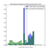
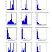
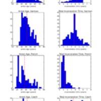
Below is a gallery of the histograms that I produced using this outlined procedure.
For a detailed description of the content and interpretation of these histograms, please refer to the Histograms Using Python page under the Presentation of Results section.
