Carto
Much like Palladio, Carto is an online tool designed for data visualization with particularly powerful map visualization capabilities. Carto is an ideal substitute for Palladio: it contains many of the same features that Palladio offers without Palladio's aforementioned problems and limitations. In this section, I will describe the process that I used to create map visualizations in Carto.
My main goal with Carto was to produce a map showing the arrest dates of clergy as a function of time and space. Carto is well-suited for this visualization, as it seamlessly integrates georeferenced locations and dates from CSV files, as long as they are in the correct formats. Fortunately, the formats requested by Carto were very similar to that of Palladio, and thus, I only had to write a small amount of Python code to convert the CSV file that I used for Palladio into one suitable for Carto. The code that I used to produce the spreadsheets that I added to Carto is the same Python script that I used to generate the histograms; to see the actual code, please refer to the "Histograms" page.
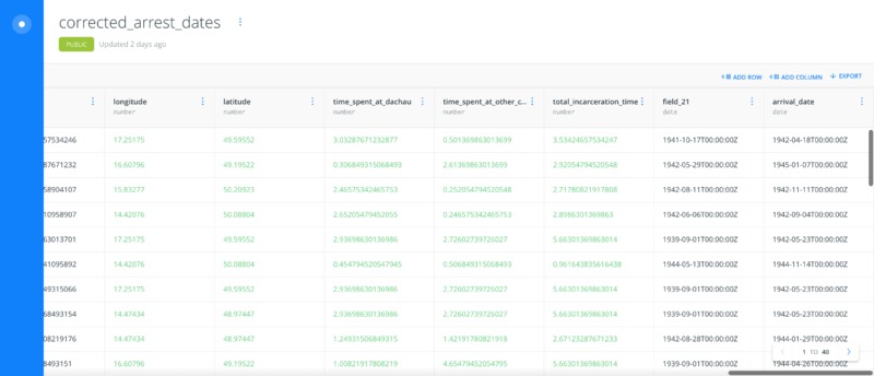
I began by importing the CSV file into Carto as a Dataset. After importing the Dataset, it appears in the following interface:
Note that the columns extend off the page and must be viewed by scrolling horizontally. Carto then attemped to determine the data type of each field, where the available data types were:
- Number
- String
- Date
- Boolean
For the data fields that were not identified correctly, I manually changed them. The image above shows the dataset after I had converted each field to the correct format. Note that Carto successfully accepted the date format that I had in my original CSV file (this format was "YYYY-MM-DD"). With the dataset in place, I was now ready to create a map.
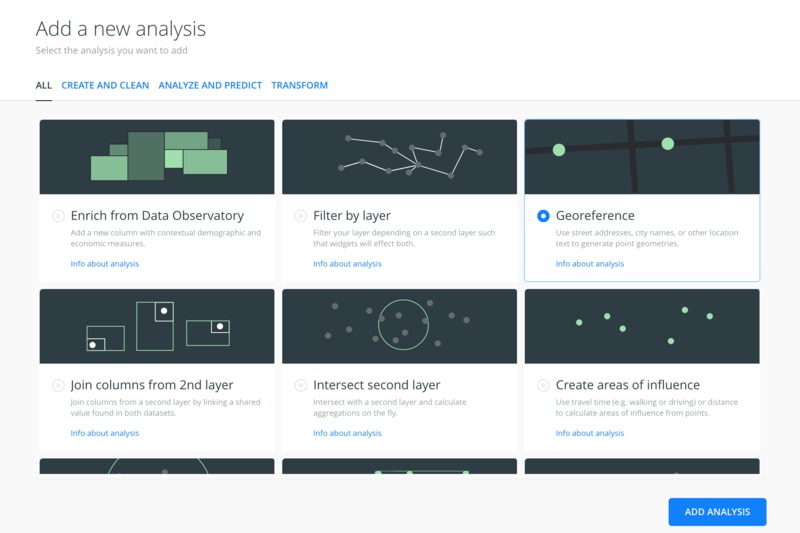
After creating a new map using this dataset, I georeferenced the data. Fortunately, Carto Builder allows this to be done quite simply. For the layer associated with the dataset, selecting Analysis gives a number of options:
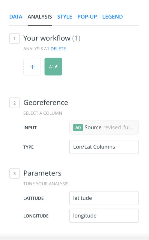
Selecting the Georeference option then brought up the following options on the map page:
I then simply selected the latitude and longitude columns for the Latitude and Longitude fields, respectively. Carto then georeferenced all of the datapoints with associated latitude and longitude coordinates, namely those with an associated diocese (for a description of the selection bias introduced by this, please refer to the Histograms and Distribution of Incarcerated Clergy across Europe Using Carto pages).
At this stage, I then had the flexibility to experiment with different forms of interactive maps. In particular, I decided to create the following three maps:
- A map showing the arrest date of clergy as a function of time and location
- A map showing the arrival date of clergy at Dachau Concentration Camp as a function of time and location
- A map showing the distribution of clergy in the form of a 2-dimensional histogram overlaid on the map
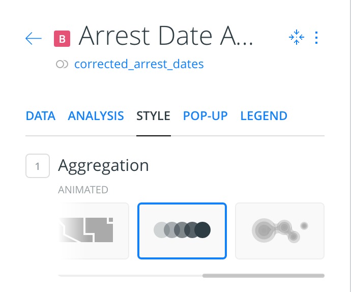
Adding a time series animation required only a few steps. Selecting the layer, the style tab displays an option for adding an animation:
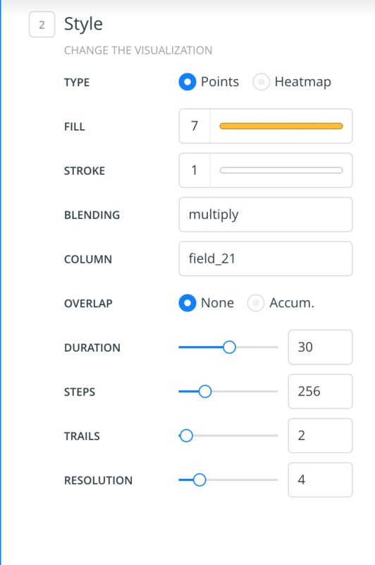
Under the Style options, the desired date field for the animation can then be selected under the Column option (in this instance, I chose the dates in field_21):
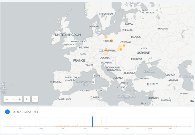
The other parameters can be used to change features of the animation itself (the color of the dots as they appear on the map, the number of time steps in the animation, etc.). With this, Carto produces an animation, where dots appear on the map as Carto progresses through time:
Note the bar moving through a histogram of dates at the bottom of the animation. In practice, this animation is interactive, but I have included screenshots here to highlight salient points; the full animation is available in the Presentation of Results section of this exhibit.
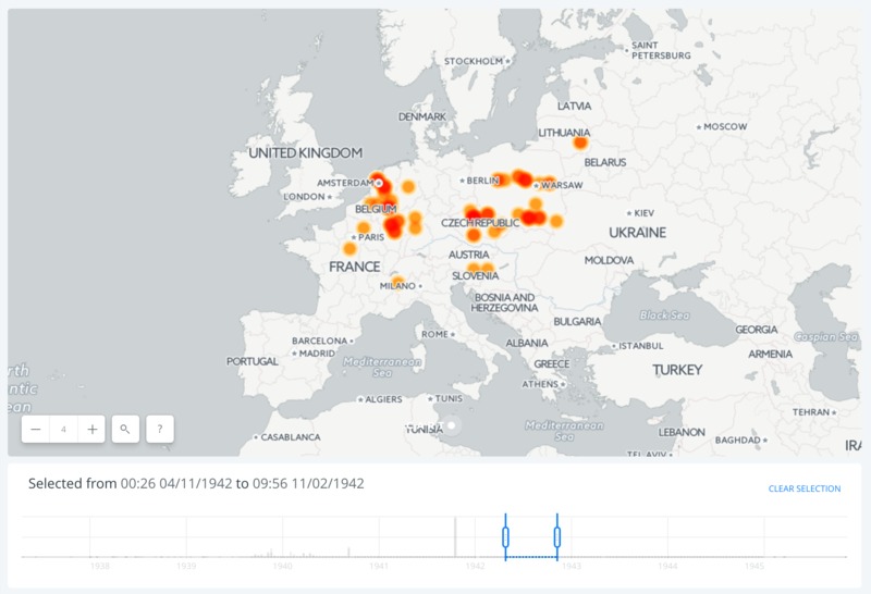
Another feature of the timeline is that the user can drag across a range of dates on the bottom timeline, producing a heatmap of points on the map corresponding to the range of dates:
Using this outlined procedure, I was able to generate the two interactive maps for arrest date and arrival date at Dachau Concentration Camp.
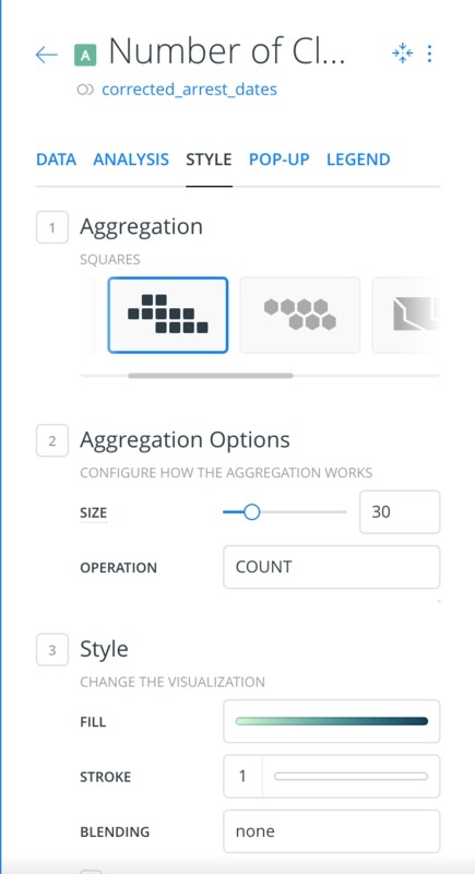
In order to produce the two-dimensional histogram showing the distribution of clergy across Europe, I used the aggregation feature under the Style tab:
In particular, I selected the COUNT option for the aggregation operation, meaning that the colorscale of each square bin on the map would be associated with the number of clergy in each bin. The size option controls the size of the square binning scheme, allowing for more or less resolution, as desired. Furthermore, the FILL option in Style contains a number of different color schemes that the user has the option of selecting.
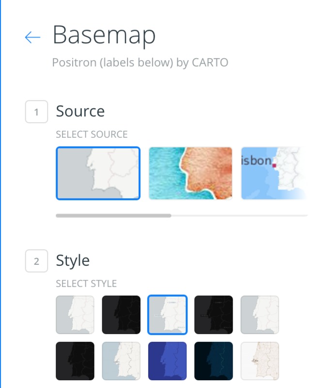
Furthermore, for the two animated maps, I chose to change the background map in Carto. The choice of the background map here is important because country borders were constantly in flux during the time period of interest, and it is important not to mislead the user with a poorly-chosen background map. However, it is also difficult for the user if there is no indication of the general locations of countries on the map. Thus, I chose to use the default positron map for the two-dimensional histogram map described above -- the borders are noticeable but not intrusive. Furthermore, the map displays both countries and cities, making it possible for the user to orient oneself without being influenced directly by the borders; it is also in some sense helpful to orient the user with current borders. For the two animated maps, I chose a version of the positron map in which the country and city labels appear as labels on the bottom layer, meaning that they do not appear as prominently. I changed the background map by going to the base layer:
and then selecting the map that I wanted to use:
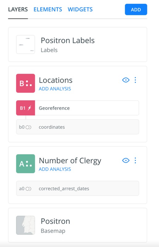
Lastly, for all of these maps, I added the location of Dachau Concentration Ccamp by creating a new dataset that contained the latitude and longitude coordinates of Dachau:
I then created a new layer using this dataset, georeferenced the dataset, and changed the size of the point representing Dachau on the map as desired. Thus, all that was left was to embed these maps into my Omeka exhibition.
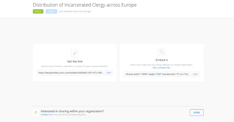
Embedding a Carto map into a webpage is as simple as settling on the desired map (including zoom level, etc.), clicking the publish/update button, and then copying the embed code, as seen below:
Following this procedure, I created my third and final interactive map. These interactive maps can be found on the pages Distribution of Incarcerated Clergy across Europe Using Carto and Animated Maps Using Carto in the Presentation of Results section, where I provide a more detailed description of the maps themselves.
