Palladio
Palladio is a visualization tool designed for historical data and created by the Stanford Univerity Humanities + Design Research Lab. It is an online tool that produces, among other types of visualizations, interactive maps that integrate temporal data with spatial data. In particular, the timeline feature allows the user to display geographic information on a map as a function of date by selecting ranges of the timeline and moving the cursor across the timeline.
These features are particularly well-suited for exploring correlations between different data fields for my project. My interest is in correlating dates of arrest and arrival at Dachau with geographic location at the time of arrest.
I have chosen to use the diocese location as a proxy for location at the time of arrest because the dioceses represent the Catholic Church's geographic assignment. Furthermore, other data fields, such as birth location and location at the time of arrest, are riddled with locations that are in the GeoNames database.
At this point, it is important to discuss the selection bias introduced here. By mapping only those clergy with a listed diocese, I am selecting for Catholic priests (though the overwhelming majority of incarcerated clergy were Catholic). In addition, this field is incomplete, in that it does not appear for each of the Catholic priests, meaning that there are holes in the dataset. Unfortunately, because I did not create the original CSV file, I have no way of identifying the origin of this incompleteness, and this could be another selection bias. On the Distribution of Incarcerated Clergy across Europe Using Carto page, I provide evidence that this selection bias does not impact the relative proportions of the different nationalities. Regardless, one possible circumvention of this issue would be to assign a geolocation based on nationality for the remaining priests; though this would not be ideal, in that the geolocations would only be approximate, it would nonetheless help to curb the effects of selection bias.
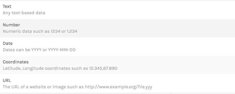
Palladio allows the user to import data in CSV format. In particular, Palladio accepts a number of different data types but requires the data be in specific formats when imported. These formats can be seen below:
This means that I had to reformat the coordinates and dates in the CSV file. Formatting the coordinates in the form (latitude, longitude) was quite easy: I simply wrote two lines of code in my python script that added the geolocations to the CSV file in order to match the desired coordinate data format. Formatting the dates in the CSV file required slightly more work because the dates in the CSV file were in the following formats:
- M/D/YY
- MM/D/YY
- M/DD/YY
- MM/DD/YY
- M/D/YYYY
- MM/D/YYYY
- M/DD/YYYY
- MM/DD/YYYY
where all dates before 1900 were of the format YYYY, and all dates after 1900 were of the format YY. The single M and D refer to instances where the value was less than 10 (for instance 5/7/29). The desired data format for Palladio is: YYYY-MM-DD. We can accomplish this by 8 find and replace commands using regular expressions:
,(\d)/(\d)/(\d\d),
,19$3-0$1-0$2,
,(\d)/(\d\d)/(\d\d),
,19$3-0$1-$2,
,(\d\d)/(\d)/(\d\d),
,19$3-$1-0$2,
,(\d\d)/(\d\d)/(\d\d),
,19$3-$1-$2,
,(\d)/(\d)/(\d\d\d\d),
,$3-0$1-0$2,
,(\d)/(\d\d)/(\d\d\d\d),
,$3-0$1-$2,
,(\d\d)/(\d)/(\d\d\d\d),
,$3-$1-0$2,
,(\d\d)/(\d\d)/(\d\d\d\d),
,$3-$1-$2,
With these changes to the CSV file, it was ready to be uploaded into Palladio.
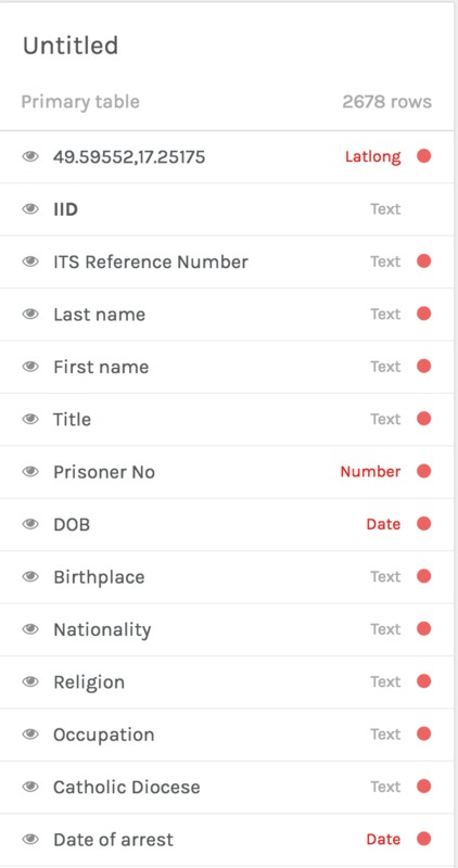
After uploading the CSV file, Palladio successfully identified the correct data type for these data fields. Below is a screenshot of part of the dataset immediately after being imported:
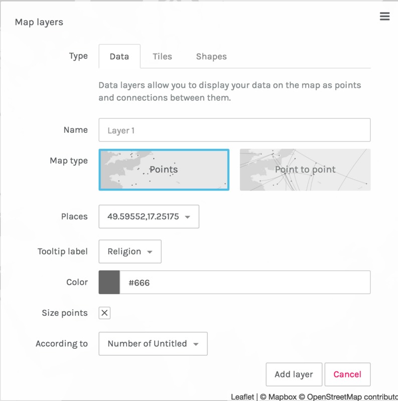
Selecting the Map tab, we are now ready to create a new layer to add to the map:
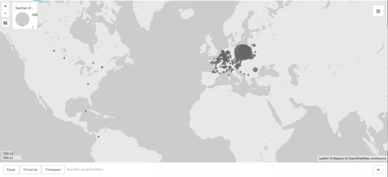
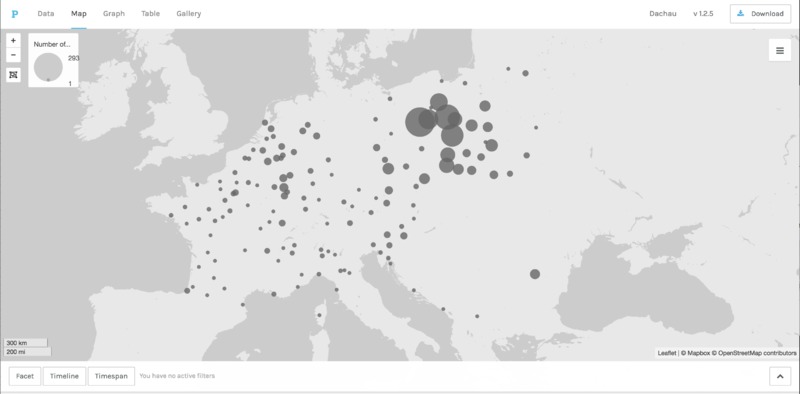
In particular, we select the geolocations for the Places field. The tooltip label controls the data field that is displayed when the user places the cursor on top of a datapoint. For this test, I have simply chosen to overplot religion, though other data fields, such as name, could be displayed instead. Furthermore, I have selected to size the points according to the frequency of the diocese. The resulting map is displayed below:
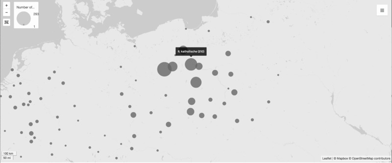
One can see that a handful of geolocations are incorrect, as they should all be concentrated in Europe. However, this represents < 1% of all of the data points, so we can simply ignore them. Zooming in on Europe, the map appears as follows:
Placing the cursor over one of the points reveals the number of clergy from the diocese, broken down in terms of religion:
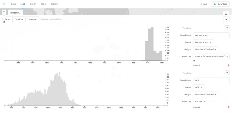
Furthermore, Palladio makes it simple to add timelines that allow the user to display the spatial data as a function of temporal data. Here, I have added two timelines, one for the date of arrest and one for birthdate:
Though Palladio is a great tool for producing quick visualizations of spatiotemporal, georeferenced data, Palladio is not ideal for creating permanent visualizations that can be embedded into another website, such as this Omeka exhibition. Palladio theoretically allows for the visualization to be downloaded; however, I was unable to download this project using the download button (using the "inspect element" feature of Chrome reveals 1959 errors associated with the download button). Furthermore, Palladio does not provide an alternative method for saving a project. Consequently, I chose to abandon Palladio as a viable tool for producing visualizations and instead opted for Carto, which I discuss on the Carto page of this section.

