Presentation of Results
In this section, I present the results of my semester-long research. In particular, I present the following visualizations:
- an interactive map that allows the user to view selected biographical information of clergy from 14 different German dioceses
- a map showing the distribution of incarcerated clergy across Europe
- animated maps showing the locations of clergy across Europe as a function of arrest date and final arrival date at Dachau, one of which appears below
- histograms plotting distributions of various fields of information such as incarceration time, broken down by fate and by nationality
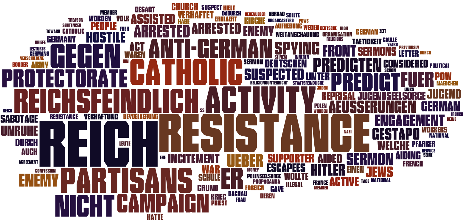
- a word cloud displaying the most frequent words in the reasons for arrest
Furthermore, I contextualize these visualizations within the history of Dachau Concentration Camp.
The above visualization, produced using Carto, shows the locations of clergy as a function of arrest date.