Breakdown by Nationality
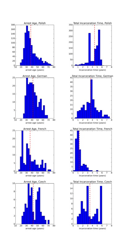
It is instructive to analyze the histograms of the previous page broken down by nationality. Below, I have plotted histograms of arrest age and total incarceration time for clergy of four nationalities: Polish (a final sample size of 1126), German (a final sample size of 204), French (a final sample size of 134), and Czech (a final sample size of 76).
Note that because there are only 76 Czech datapoints, these histograms for Czech clergy are particularly subject to shot noise, causing the histograms to appear noiser than the Polish ones, for example.
Though it is difficult to identify any interesting correlations with arrest age, the total incarceration times do reveal two interesting features:
- The average total incarceration time for French clergy is significantly shorter than those for other nationalities.
- The distribution for total incarceration time for Polish clergy is extremely bimodal -- this is not shot noise here, as the sample size for the Polish clergy is 1136.
The former observation can be seen in the animated Carto maps; these histograms provide confirmation of this phenomenon. However, the second observation is difficult to see in the animated Carto maps, thus serving as an example of how different types of visualizations reveal different aspects of the datasets.
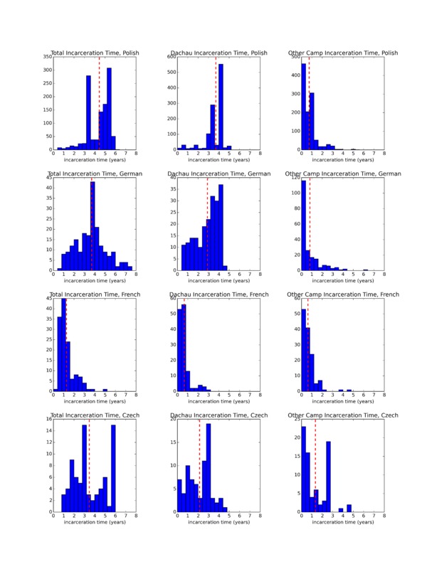
To delve further into these observations, I produced the below twelve-panel histogram, which breaks the total incarceration time into three categories, as decribed in the Histograms page of the Methodology section:
- Total incarceration time (calculated as liberation date - date of arrest)
- Time incarcerated at Dachau Concentration Camp (calculated as liberation date - final arrival date at Dachau)
- Time incarcerated at other concentration camps (calculated as final arrival date at Dachau - arrest date)
From these plots, one can see that the average incarceration times in camps other than Dachau are comparable for all nationalities, and the cause of the total incarceration times being shorter for French clergy than clergy of other nationalities is the significantly shorter durations of incarceration time at Dachau specifically. Indeed, French nationals were sent to Dachau Concentration Camp as early as 1943, but in the summer of 1944, the Gestapo "evacuated the camps in France, Belgium, and the Netherlands and transferred the prisoners to concentration camps in the Reich, including Dachau." [1] Thus, this observation that the French clergy were incarcerated for comparable amounts of time at other camps but significantly shorter periods of time at Dachau specifically is consistent with the large-scale transport patterns of the Nazi regime. This suggests that in this instance, the French clergy were subject to the same transport patterns as the other French prisoners.
Furthermore, the bimodality in the Polish distributions can be seen in the histograms of incarceration times at Dachau and at other camps. The spike in total incarceration times of approximately 5 years can be attributed to the mass Polish deportations in 1940. [2] This spike is also discussed in the context of the animated maps in this section. Determining the cause of the spike in total incarceration times of approximately 3 years proved to be more difficult. One possible cause was Himmler's push for more prisoners to be sent to labor camps in 1942. [3] One reason for the very small fraction of Polish clergy incarcerated for fewer than 3 years could be that by 1943, a large majority of the Polish Jewish population had been killed, meaning that transports had to be taken from regions outside of Poland still with Jewish populations. [4] Perhaps fewer Polish clergy were arrested and transported beginning at this time simply because the transports of the Jewish populations had shifted.
As a general word on the histogram as a form of data visualization, there are advantages and disadvantages to histograms in this context, in comparison to the maps that I created using Carto. In particular, histograms allow for more quantitative analysis than do animated maps, in that histograms can be used to show distributions and averages of temporal quantities (such as incarceration time). Therefore, they enable trends to be identified that are difficult to identify in the animated Carto maps. A primary example of this is the bimodal distribution of Polish incarceration times: while this is immediately apparent in the histogram plot, it is not so obvious in the animated map of arrest dates.
However, histograms nonetheless contain fewer dimensions of information and therefore inevitably project out interesting quantities and correlations. Of course, this can be partially circumvented by creating multipanel histograms or overplotting multiple histograms on top of one another, as evidenced by the histograms on this page and here. Furthermore, tools such as Tableau enable dynamic histograms that allow the user to interact with the data by hovering or clicking on relevant portions of the histogram.
1 Page 155. Distel, Barbara, and others, eds. The Dachau Concentration Camp, 1933 to 1945. 3rd ed. Munich: Comite International de Dachau, 2005.
2 Pages 20, 160. Distel, Barbara, and others, eds. The Dachau Concentration Camp, 1933 to 1945. 3rd ed. Munich: Comite International de Dachau, 2005.
3 Pages 20, 160. Distel, Barbara, and others, eds. The Dachau Concentration Camp, 1933 to 1945. 3rd ed. Munich: Comite International de Dachau, 2005.
4 Page 42. Marcuse, Harold. Legacies of Dachau: The Uses and Abuses of a Concentration Camp, 1933-2001. Cambridge: Cambridge University Press, 2001.


